Role: Designer, Copywriter, Art Director
Location: Dubai, UAE
Clients: Dubai Racing Carnival/ Club/
The Brief
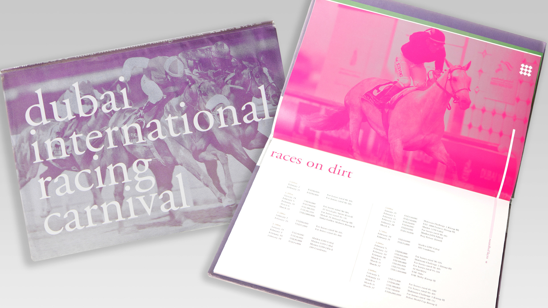
Create a limited edition book for VIPs and royalty of UAE to celebrate the Carnival Season. A visual masterpiece filled with stunning photography, capturing the excitement, vibrancy, and colour of this world class event.
Create a limited edition book for VIPs and royalty of UAE to celebrate the Carnival Season. A visual masterpiece filled with stunning photography, capturing the excitement, vibrancy, and colour of this world class event.
The Solution
Inspired by the bold colours and distinctive patterns of jockey silks, I designed a luxurious hardback book that embodied the spirit of the Carnival. A satin ribbon closure added a ceremonial touch, inviting guests to cut it open an elegant, augural way to mark the occasion. I selected metallic paper/ ink to create a striking duotone effect, ensuring exceptional print quality and a truly standout finish. The book was a resounding success, cherished by the client and recipients alike as a lasting memento of the celebration.
Adobe Photoshop, Adobe Indesign
Role: Designer, Copywriter, Art Director
Location: Dubai, UAE
Clients: Dubai Racing Club
The Brief
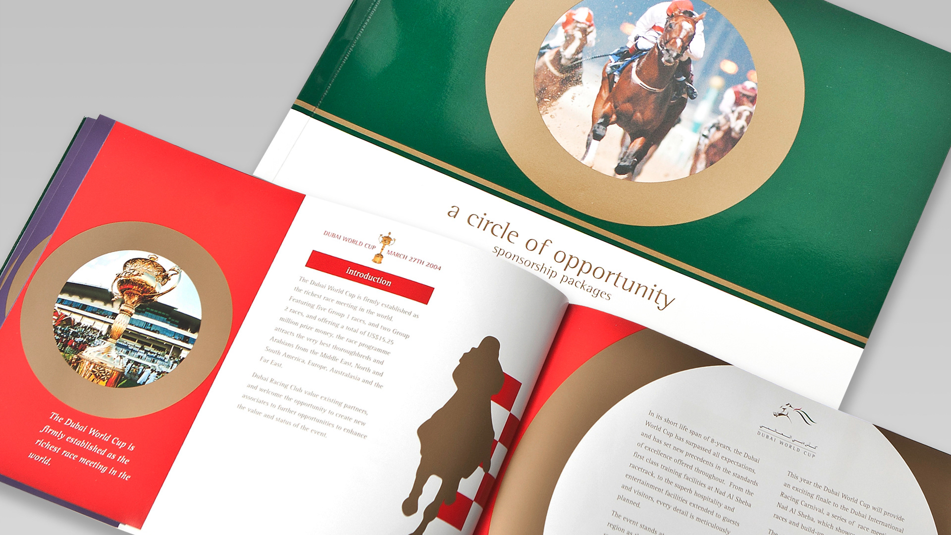
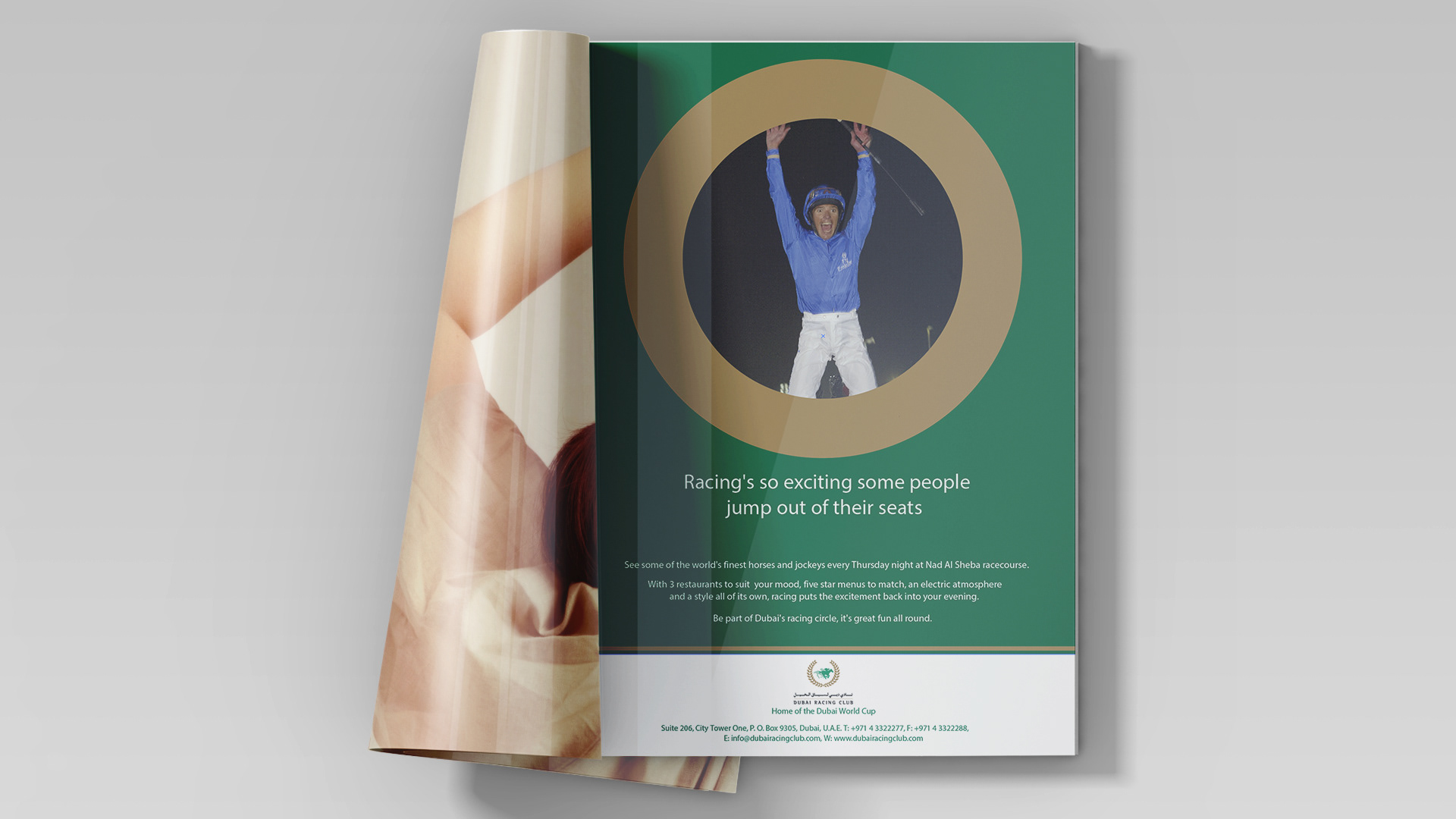
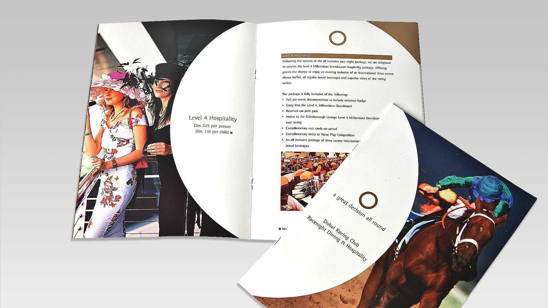
Dubai Racing Club needed a distinctive brand identity. As a private members’ club, it lacked a clear visual presence and premium positioning. The challenge was to create an identity that would feel exclusive yet inviting one that could be seamlessly rolled out across all touch points, from brochures and parking permits to member badges and advertising. It had to be bold, memorable, and unmistakably premium.
The Solution
I developed the concept: “Be part of the Dubai Racing Circle.”
Drawing inspiration from the idea of exclusivity and connection, the visual identity centred around the bold, modern form of a circle a symbol of unity and prestige.
Drawing inspiration from the idea of exclusivity and connection, the visual identity centred around the bold, modern form of a circle a symbol of unity and prestige.
A refined three colour system was introduced to differentiate the club’s key events: red became synonymous with the World Cup, green represented the Dubai Racing Circle, and purple defined the Carnival Season. This cohesive, premium look created strong visual recognition and a clear sense of belonging for members. The new identity was rolled out across all branded materials, elevating the club’s image and firmly positioning it as a leader in the world of elite racing.
Role: Designer, Copywriter, Art Director
Location: Dubai, UAE
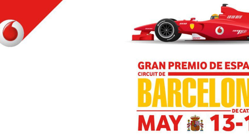
Clients: Dubai World Cup Branding
The Brief
The Dubai World Cup, long seen as an event for an older, traditional audience, needed a bold transformation to capture the attention of a younger, style conscious generation.
The Solution
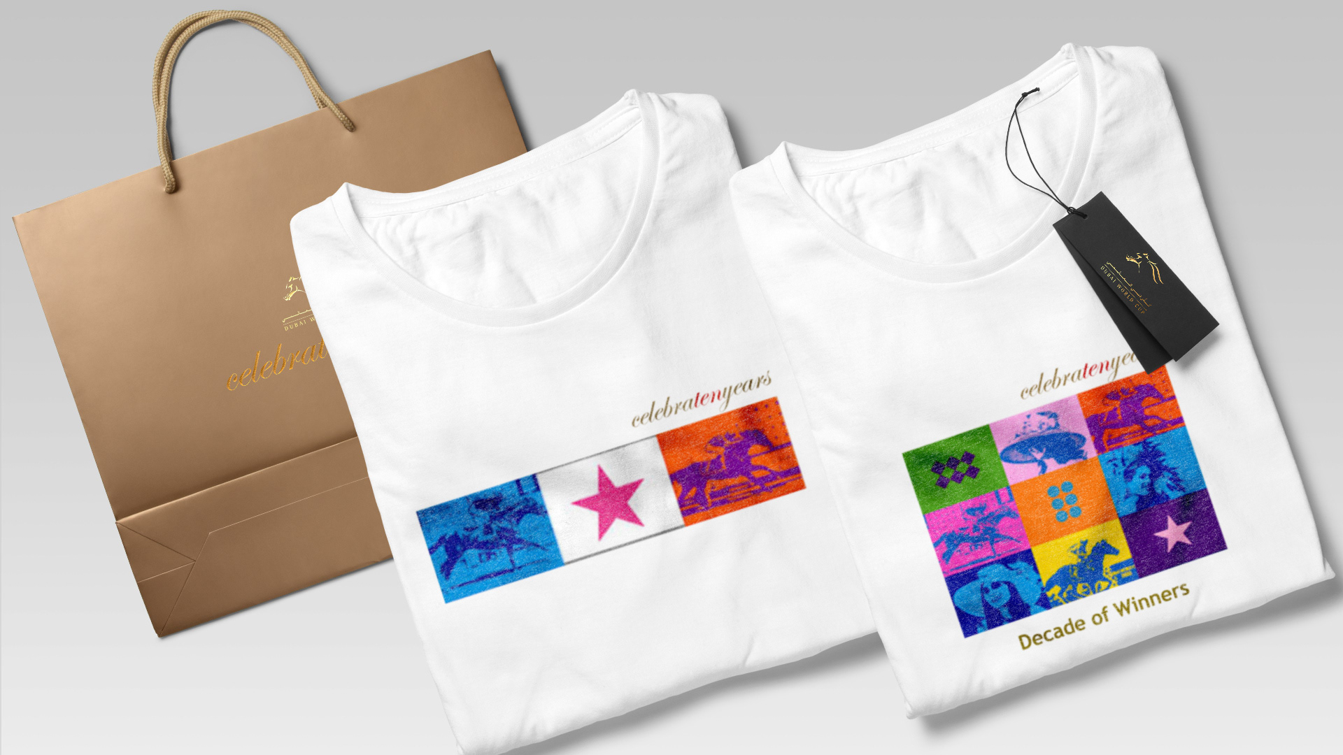
Influenced by pop art and the racing silks. I reimagined the Dubai World Cup as a bold, style-driven spectacle.
Using the traditional racing silks as my starting point, I created a vibrant color palette and striking graphic patterns that stood out against the Dubai landscape. This bold visual identity was rolled out across every touchpoint branding, advertising, and a new line of official merchandise that blurred the line between sportswear and streetwear, elevating the event into a true fashion moment.
It was a big risk but the client loved the new look. That year, the Dubai World Cup successfully attracted a younger, fashion-forward crowd and became known as the go to cultural and lifestyle event.
The success didn’t stop there: for three consecutive seasons, I pitched and retained the account for the agency, helping the Dubai World Cup continue to grow its reputation as a symbol of modern luxury, style, and tradition reimagined.